
4.2 Analyzing Infographics
Information graphics or infographics provide visual representations of information, data, or knowledge that many writers use to present information quickly and clearly. They can raise awareness of a problem, provide facts and figures that serve as a tangible point of reference, lend a visual element to the story you want to tell by helping readers see patterns and trends, simplify a potentially complex concept in ways that keep readers’ attention, make the information memorable, and process information in ways that engage readers’ interest and help them draw conclusions that can reframe a problem and lead to action.
All of these points are worth considering in light of what we observe about how people process information – that we grab bits of information quickly u a very narrow field of vision. All of us process information much more effectively when images accompany the written words.
To illustrate the strategies that you can use to interpret an infographic, we will take a close look at Figure 4.2. an infographic that the American Civil Liberties Union (ACLU) designed to create awareness of a persistent problem that many researchers and community activists have described as the “School -to-prison pipeline.”
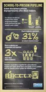 Figure 4.2.ACLU Infographic
Consider the images and text that draw your attention
Take a few moments to identify and reflect on what draws your attention in Figure 4.2. What questions does the title of the infographics, “School-to-Prison Pipeline,” mean to you? Have you heard this phrase before? It is in block letters at the top, but is this what grabs your attention first? What about the number “31%,” at the center, which is in a larger font size than the title, or “3x,” which is even larger? What do these numbers mean? Three times more than what? Why is the explanatory text in white letters and in such a small font? What does a chalkboard, the background of this infographic, bring to mind? What memories does this image help you recall? What happens – or should happen – in school? What emotional effect do images of handcuffs, a pipeline, or jail have on your understanding of the story that the designer of this infographic wants to tell? Are these images of handcuffs and a jail what you typically associate with school and your own experience? What is the designer of this infographic getting you to think about? What connections and conclusions are you mean to draw the data and images?
Identify the organization, its ethos, and framing concepts
As suggested in the analysis of advertisement, it is important to identify how the creator or sponsoring organization wishes to be perceived. Consider the organization’s mission and values to help you assess any underlying bias. How does your knowledge of the organization affect how you process the information in the infographic?
The ACLU’s logo appears in the bottom right corner of the infographic and is meant to stand out as the underwriter of this work. According to their website, the ACLU, based in New York City, is a nonprofit organization that has worked in courts, legislatures, and communities to protect people in the United States from civil rights violations. The ACLU is by most accounts a well-respected organization that brings a great deal of credibility to discussions of civil and human rights. This is an important part of the ethos of the ACLU’s work. It advocates for individuals who lawyers in the ACLU believe have been treated unfairly, and this history of advocacy serves as a frame or lens through which to understand the purpose(s) of infographic. At least one purpose seems to bring to light the lack of fairness, equity and social justice in the treatment of black students in what should be an otherwise safe space where students attend school to receive an education In this case, we can ask what is the best way to represent the school-to-prison pipeline, whose interests will be served by making the public aware of the problem, and what can be done to address the violation of people’s rights?
Determine the credibility of the Data
It is one thing to believe in the reputation of a sponsoring organization such as the ACLU, but it is another to ensure that the data presented in an infographic is also trustworthy. What is the source of the data, are the data credible, and why should the school-to-prison pipeline matter? With a little research, you might find different definitions of the school-to-prison pipeline. For many, it is a process through which students are pushed out of schools and into prisons. The infographic cites research that shows that the implementation of “zero-tolerance policies” for fighting or bringing weapons to schools has led to significant increases in suspensions and expulsions over the years. Data show that students, once suspended or expelled, are less likely to complete high school. The data show in Figure 4.2 indicate that three times the number of black students is suspended and expelled than white students, but is this data credible?
It is helpful to do some research by following up on the footnotes are the bottom of the infographic. The U.S. Department of Education Office for Civil Rights found in their report in 2014 that there have been disproportionately high suspension/expulsion rates for students of color. By looking up the cited report, we can see that it provides data to support the specific claim in the infographic: that black students are suspended and expelled at a rate three times greater than white students.
Analyze how the infographic appeals to logos
The infographic is designed in such a way as to lead readers from a clear statement of a claim, again that “School disciplinary policies disproportionally affect black students,” to specific evidence supporting that claim. The source of this evidence is published research illustrated in the graph at the top right of the infographic and reinforced at the center in large bold numbers. The data underscore the magnitude of the problem. Black students make up just 16 percent of public school enrollment, yet black students represent 31 percent of all arrests. They are three times as likely to be suspended or expelled as white students, even though they make up less than 20 percent of public school enrollments. In addition, they are suspended or expelled for reasons that are left up to the discretion of teachers, administrators, school resource officers, and the like. These reasons are not spelled out. However, research presented in the study footnoted at the bottom of the infographic indicates that black students can be suspended for such things as fighting, damaging property, or insubordination. White students engaging in the same behaviors are not typically suspended or expelled for the same behaviors.
The infographic helps to simplify a complex problem that has been discussed extensively by researchers and policy makers. In doing so, it serves as a starting point for inquiry that can detail the policies that have led to disproportionality and that continue to undermine civil rights laws designed to bring about equity. Much depends on the ways readers use their knowledge and experience to make sense of the images that accompany the text and, in this case, a history of civil rights law to develop a coherent argument. The reality is that the way we construct meaning will not altogether mirror what the designer of an infographic might have in mind. After all, the process of constructing an argument is as much an imaginative process as it is logical as we move from specific pieces of evidence to a major premise.
Analyze how the infographic appeals to pathos
As we analyze this infographic on the school-to-prison pipeline, consider the extent to which the interrelationship of images and words will appeal to emotions and affect readers’ sense of immediacy, is not urgency, of a problem they may or may not know about. Does it evoke empathy or outrage? Consider the background of a well-worn blackboard that can no longer erase the past. The blackboard in the background and the school-house in the foreground might very well prompt readers to think about their own experiences in school and what the purpose of an education was for them or should be. The juxtaposition of images such as handcuffs, the bars of a prison cell, and a faceless person who is incarcerated are jarring; most people do not associate school with these images of criminalization.
We might be puzzled at first but then angry when we are forced to reckon with the reality that not all students have the same opportunities or share the same experience – not if black students are three times more likely to be pushed out of school than their white counterparts. The idea that school does not offer a path to success for all students seems unacceptable. How is this even possible in light of the landmark Supreme Court decisionBrown v. Board of Education in 1954, which brought an end to legal segregation of public schools and held out the promise of equity for all students? “Brown at 60: Still Separate, Still Unequal,” which appears just above the footnotes, is a clear reminder that this promise has gone unfulfilled.
How have schools become pathways to exclusion and punishment despite this legal decision? Is this a legal problem that the ACLU can address? Perhaps the problem is more entrenched. The infographic argues that the law has fallen short of protecting the interests of black students. Beyond the frame of this infographic, then, is the structure of inequality embedded in policies that seem immune to decisions made in the legal system. Thus, it’s hard not to see that the emotional appeal is to our sense of outrage that stems from the failures of the legal system.
Steps to Visual Analysis
- Notice where the images appear: What does the publication space tell you about the target audience? To what extent does its placement determine the potential audience?
- Identify and reflect on what draws your attention. Where does your eye go? What elements seem to be given prominence and how? Is there anything startling, shocking, or puzzling? Consider color, foregrounding, size, font choice, and other methods of visual emphasis.
- Consider ethos. What do you know about the source of the image, advertisement, or infographic? Is it a nonprofit or commercial enterprise? What values does it espouse? How do these values affect the frame through which you should interpret the image? To what extent do you share these values?
- Analyze pathos. How do the images and words appeal to your emotions? What do the images or words make you feel or think about?
- Understand logos. What is the logic that motivates the argument? Taken together, what does the cluster of images and words convey? How are the different images and words related to the claim that is made?
Media Attributions
- 4.2 ACLU Inforgraphic
